

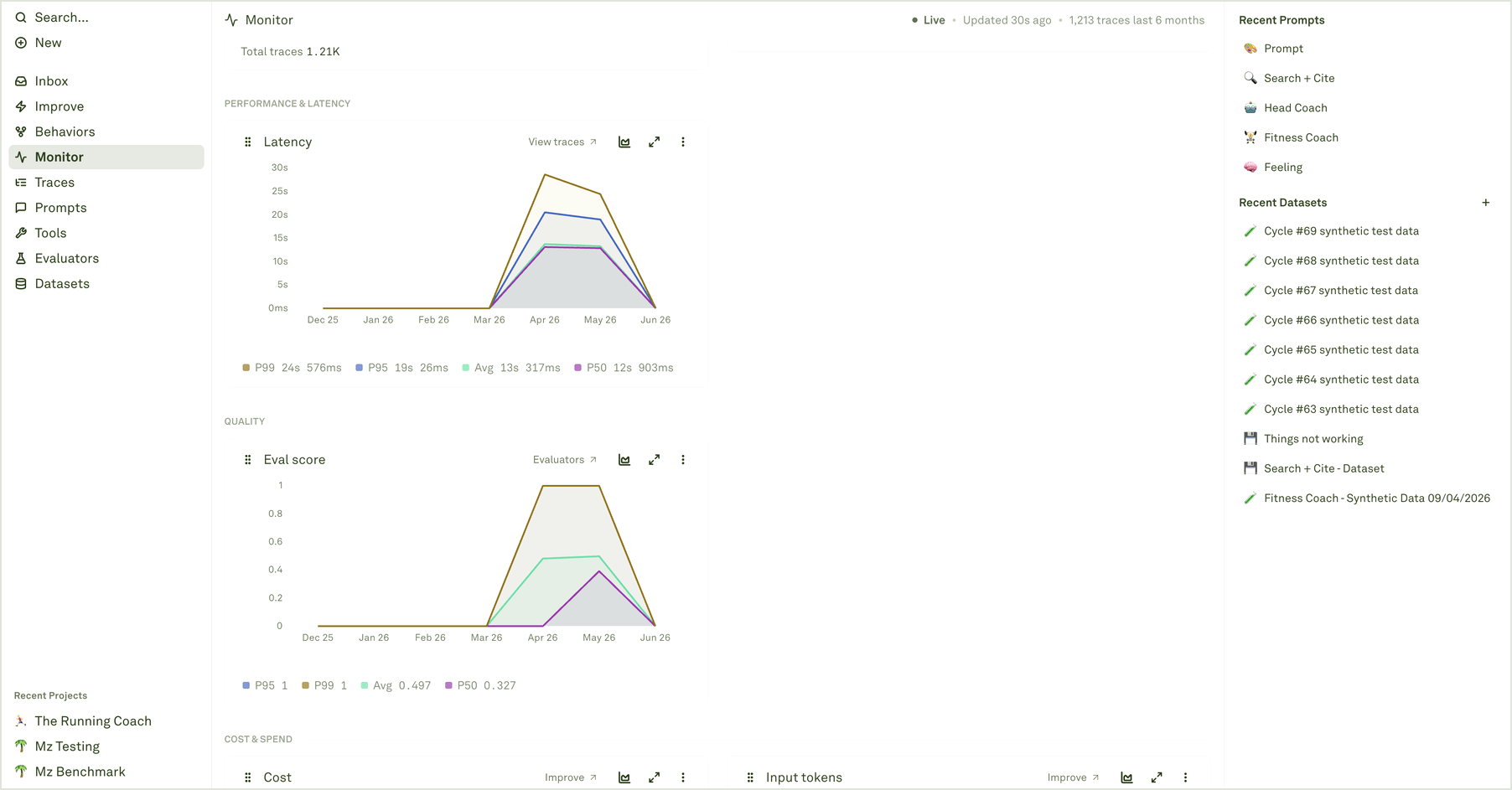
Chart groups
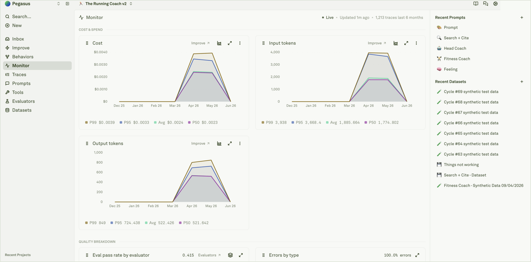
Monitor organizes charts by the question they answer:
The chart title tells you the metric. The subtitle, legend, tooltip, and link target tell you how to investigate it.
Read percentiles and averages
For latency, cost, tokens, spans per trace, and similar metrics, Monitor can show average and percentile values.
If P95 moves but average stays flat, inspect outlier traces. If both move together, the whole workflow likely changed.
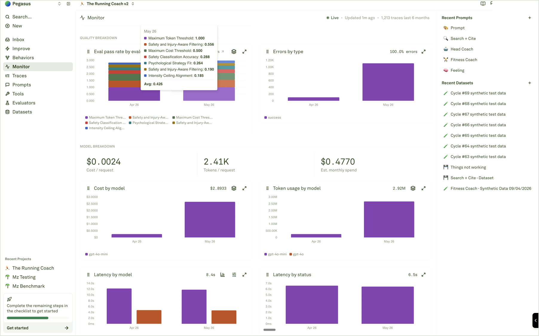
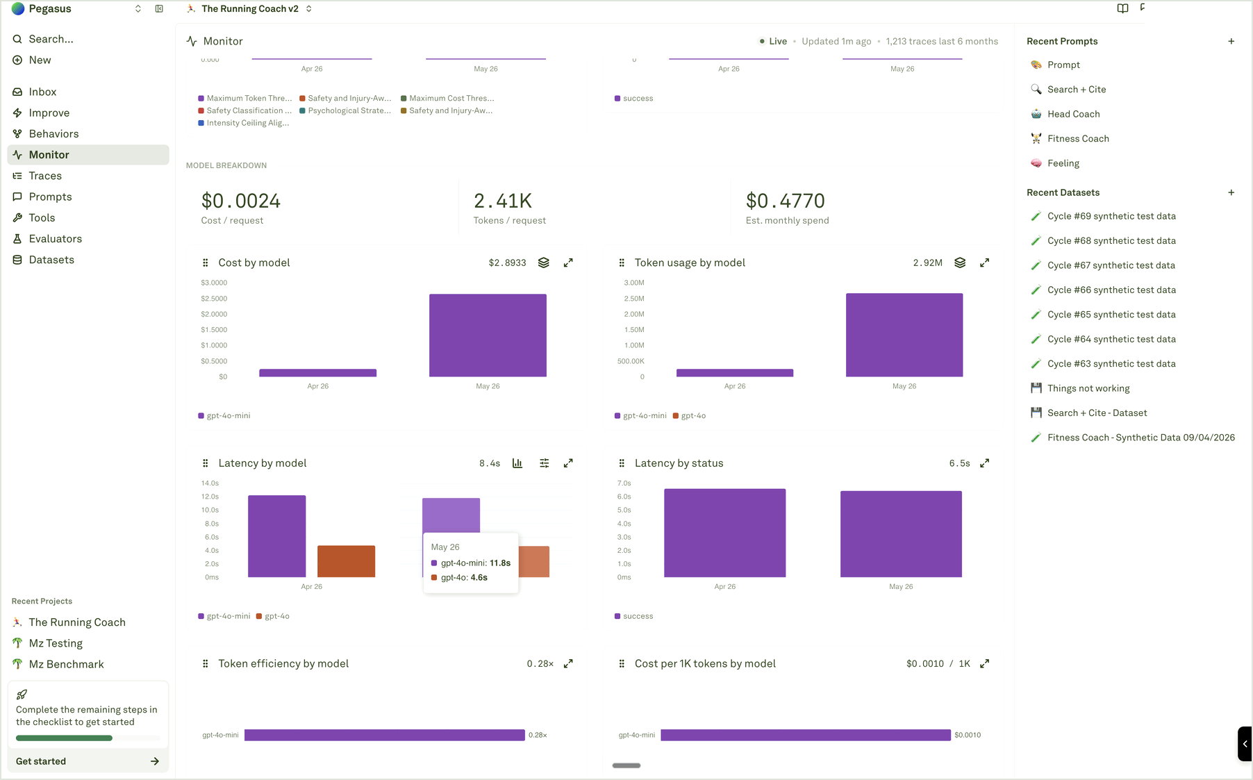
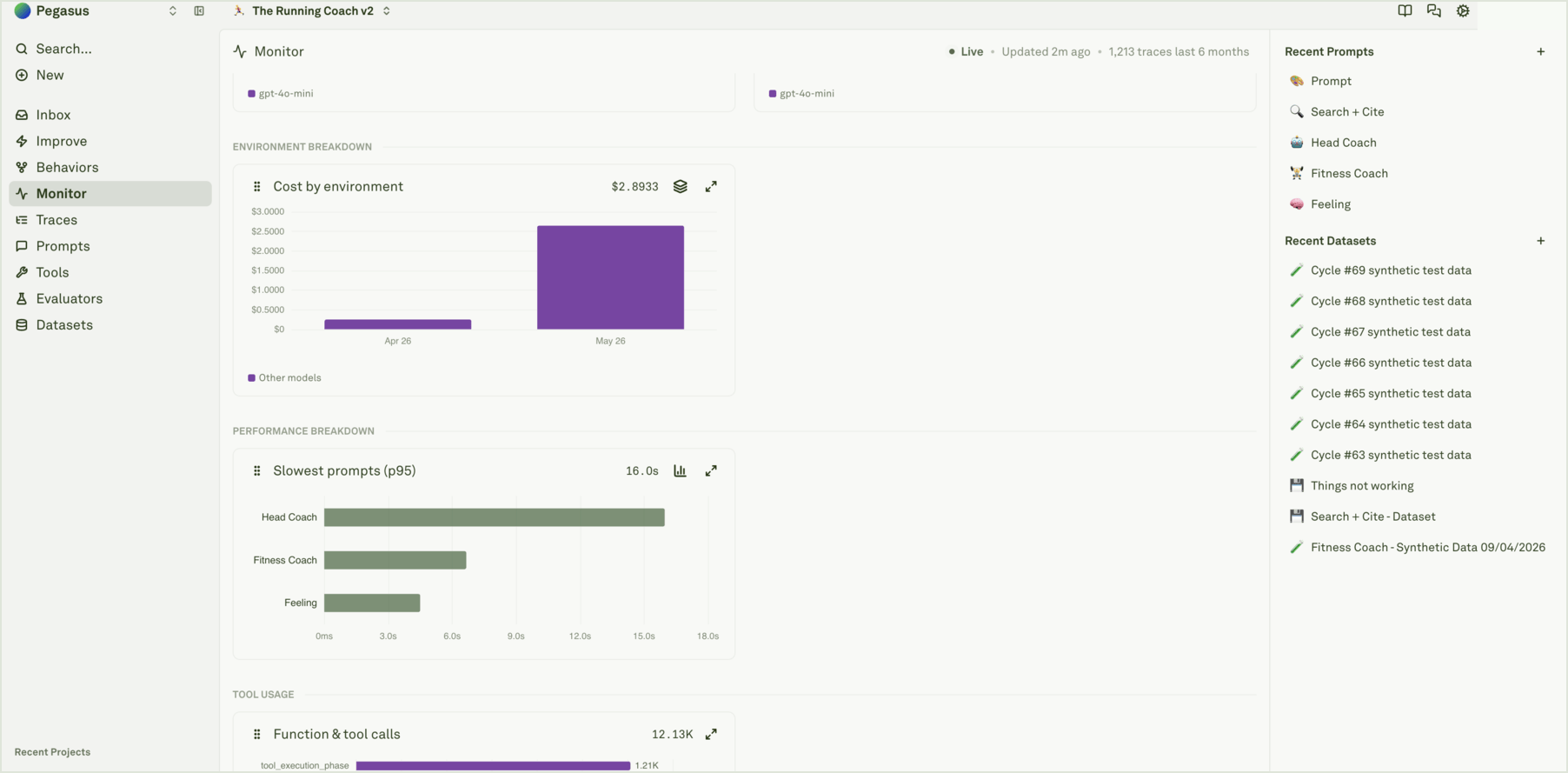
Compare models, environments, and tools
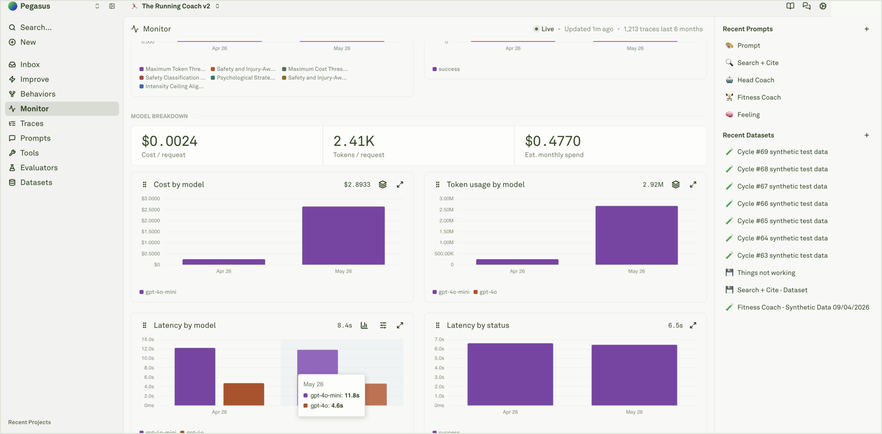
Drill into evidence
Use chart actions to move from trend to trace:- Open the chart for the metric that moved.
- Hover data points to confirm the exact bucket and value.
- Use View traces when available, or open Traces with the same time range.
- Filter by the relevant prompt, model, environment, tool, evaluator, status, cost, latency, or token signal.
- Inspect representative traces and spans before changing the system.
Common reads
Analyze log traces
Open the traces behind a chart movement.
Inspect a trace
Read tree view, waterfall view, and span details.
Setup continuous evaluations
Add quality scores to production traffic.
Use logs to improve prompts
Turn a chart signal into a reviewed improvement loop.