> ## Documentation Index
> Fetch the complete documentation index at: https://www.adaline.ai/docs/llms.txt
> Use this file to discover all available pages before exploring further.
# Analyze log charts
> Use Monitor charts to find quality, latency, cost, model, environment, and tool patterns
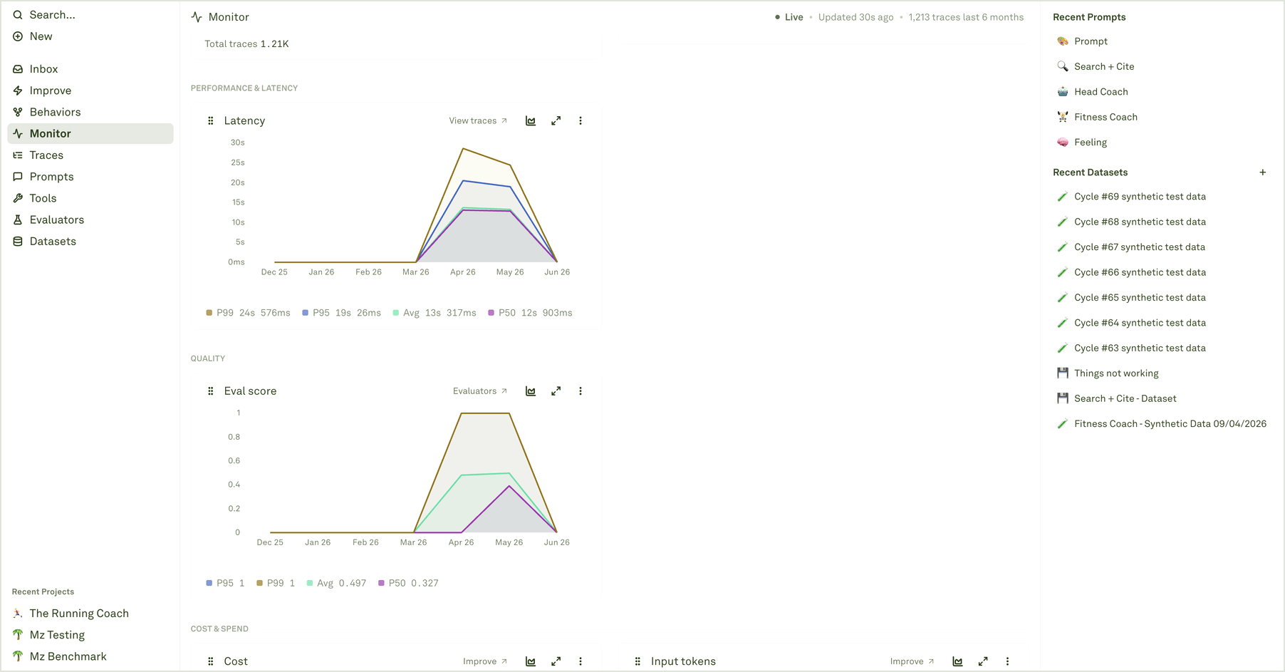
Charts turn production logs into a reviewable operating picture. Use them to find what changed, then open the underlying traces before deciding whether the fix belongs in a prompt, evaluator, dataset, tool, model, deployment, or backend system.
 ## Chart groups
Monitor organizes charts by the question they answer:
| Group | Questions it helps answer |
| ------------------------- | --------------------------------------------------------------------- |
| **Traffic & volume** | Are logs arriving? Did volume spike? Did traces become more complex? |
| **Performance & latency** | Which requests are slow? Is tail latency moving? |
| **Quality** | Are evaluator scores or pass rates changing on live traffic? |
| **Cost & spend** | Are token usage, total cost, or per-request cost increasing? |
| **Model breakdown** | Which model is driving cost, latency, token usage, or efficiency? |
| **Environment breakdown** | Is the issue isolated to production, staging, or another environment? |
| **Performance breakdown** | Which prompts or workflows are slowest? |
| **Tool usage** | Which tools or functions are being called, and how often? |
The chart title tells you the metric. The subtitle, legend, tooltip, and link target tell you how to investigate it.
## Chart groups
Monitor organizes charts by the question they answer:
| Group | Questions it helps answer |
| ------------------------- | --------------------------------------------------------------------- |
| **Traffic & volume** | Are logs arriving? Did volume spike? Did traces become more complex? |
| **Performance & latency** | Which requests are slow? Is tail latency moving? |
| **Quality** | Are evaluator scores or pass rates changing on live traffic? |
| **Cost & spend** | Are token usage, total cost, or per-request cost increasing? |
| **Model breakdown** | Which model is driving cost, latency, token usage, or efficiency? |
| **Environment breakdown** | Is the issue isolated to production, staging, or another environment? |
| **Performance breakdown** | Which prompts or workflows are slowest? |
| **Tool usage** | Which tools or functions are being called, and how often? |
The chart title tells you the metric. The subtitle, legend, tooltip, and link target tell you how to investigate it.
 ## Read percentiles and averages
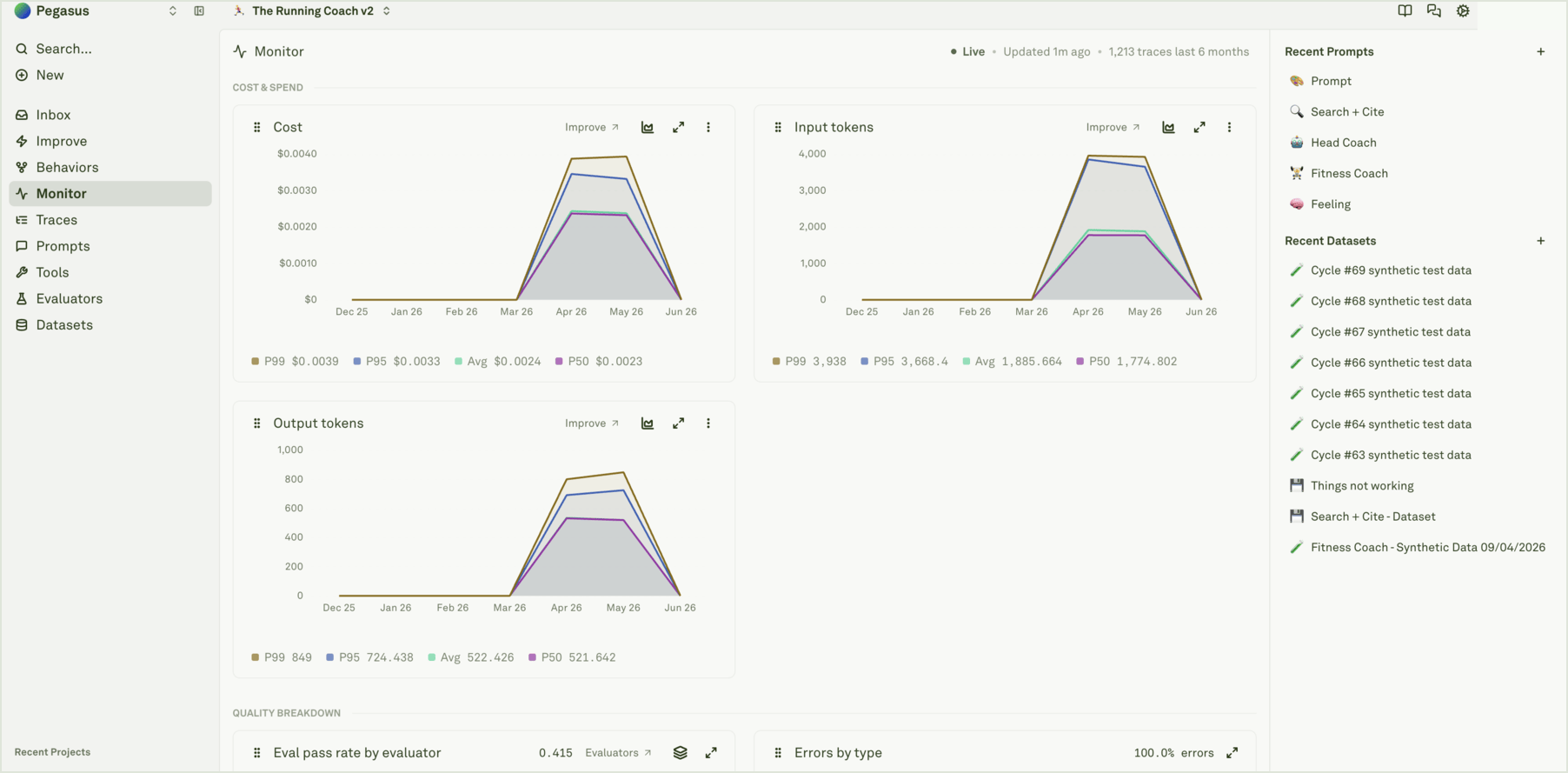
For latency, cost, tokens, spans per trace, and similar metrics, Monitor can show average and percentile values.
| Value | Use it when |
| ------- | ------------------------------------------------------------------------------------------ |
| **Avg** | You want the overall direction of the system. |
| **P50** | You want the typical request. |
| **P95** | You care about the slower or more expensive edge that a meaningful minority of users sees. |
| **P99** | You are investigating rare but high-impact outliers. |
If P95 moves but average stays flat, inspect outlier traces. If both move together, the whole workflow likely changed.
## Read percentiles and averages
For latency, cost, tokens, spans per trace, and similar metrics, Monitor can show average and percentile values.
| Value | Use it when |
| ------- | ------------------------------------------------------------------------------------------ |
| **Avg** | You want the overall direction of the system. |
| **P50** | You want the typical request. |
| **P95** | You care about the slower or more expensive edge that a meaningful minority of users sees. |
| **P99** | You are investigating rare but high-impact outliers. |
If P95 moves but average stays flat, inspect outlier traces. If both move together, the whole workflow likely changed.
 ## Compare models, environments, and tools
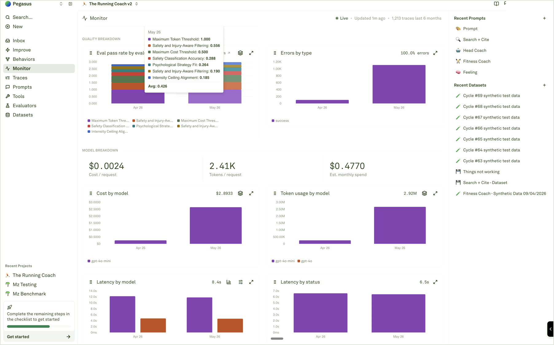
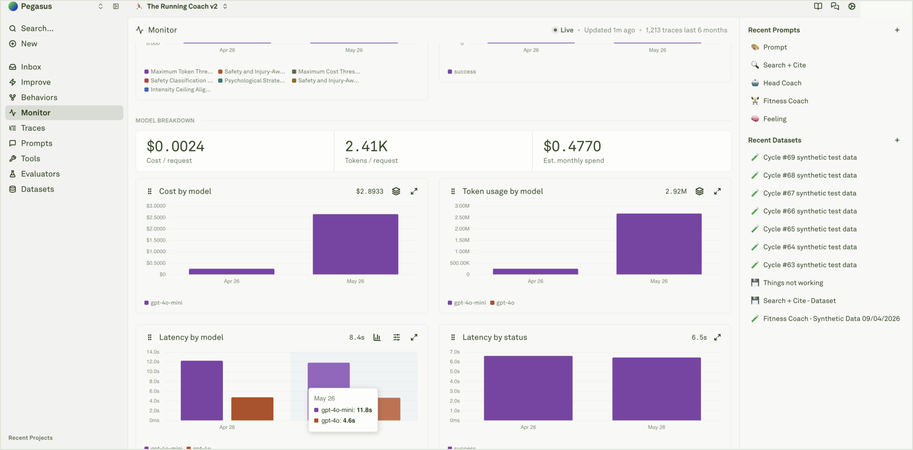 Model and environment breakdowns help separate prompt quality from runtime configuration. For example, a cost increase might come from a new model, longer inputs, more tool calls, or traffic moving into a different deployment environment.
 Tool usage charts are useful when the agent looks wrong but the root cause is upstream: the wrong tool was called, a tool returned stale data, or tool latency dominated the trace.
 ## Drill into evidence
Use chart actions to move from trend to trace:
1. Open the chart for the metric that moved.
2. Hover data points to confirm the exact bucket and value.
3. Use **View traces** when available, or open [Traces](/docs/monitor/analyze-log-traces) with the same time range.
4. Filter by the relevant prompt, model, environment, tool, evaluator, status, cost, latency, or token signal.
5. Inspect representative traces and spans before changing the system.
## Common reads
| Pattern | Likely next step |
| -------------------------------------------------- | ------------------------------------------------------------------------------------- |
| Eval score drops while latency and cost are stable | Inspect evaluated spans, then update evaluators, datasets, or Improve context. |
| Cost rises with input tokens | Review prompt length, retrieval payloads, conversation context, or tool output size. |
| P95 latency rises for one model | Compare model performance and check provider/runtime behavior before editing prompts. |
| Tool call counts shift | Inspect tool spans and Behavior patterns before assuming the final prompt is wrong. |
| A chart points to a single prompt | Open the trace evidence and decide whether to build coverage or run Improve. |
Open the traces behind a chart movement.
Read tree view, waterfall view, and span details.
Add quality scores to production traffic.
Turn a chart signal into a reviewed improvement loop.
## Drill into evidence
Use chart actions to move from trend to trace:
1. Open the chart for the metric that moved.
2. Hover data points to confirm the exact bucket and value.
3. Use **View traces** when available, or open [Traces](/docs/monitor/analyze-log-traces) with the same time range.
4. Filter by the relevant prompt, model, environment, tool, evaluator, status, cost, latency, or token signal.
5. Inspect representative traces and spans before changing the system.
## Common reads
| Pattern | Likely next step |
| -------------------------------------------------- | ------------------------------------------------------------------------------------- |
| Eval score drops while latency and cost are stable | Inspect evaluated spans, then update evaluators, datasets, or Improve context. |
| Cost rises with input tokens | Review prompt length, retrieval payloads, conversation context, or tool output size. |
| P95 latency rises for one model | Compare model performance and check provider/runtime behavior before editing prompts. |
| Tool call counts shift | Inspect tool spans and Behavior patterns before assuming the final prompt is wrong. |
| A chart points to a single prompt | Open the trace evidence and decide whether to build coverage or run Improve. |
Open the traces behind a chart movement.
Read tree view, waterfall view, and span details.
Add quality scores to production traffic.
Turn a chart signal into a reviewed improvement loop.